
This Power BI project transformed raw business files into an integrated, automated reporting system across Finance, Sales, Marketing, Supply Chain, and Executive functions. By building a centralized star schema model, creating DAX-driven measures, and applying best practices in Power Query and visualization, I delivered interactive dashboards that provide executives and managers with real-time insights, scenario analysis, and benchmarking against targets.
The organization relied heavily on scattered Excel reports across departments, leading to inefficiencies, inconsistent metrics, and delays in decision-making. Leaders needed a single reporting solution that consolidated financial, operational, and market performance into one platform, ensuring accuracy and actionable insights.
The project began with multiple compressed files that contained raw business data. These files were converted into SQL format using Git Bash commands and then imported into MySQL Workbench for structured storage. A new database connection was created to organize and manage the data, enabling seamless integration with Power BI later in the workflow.
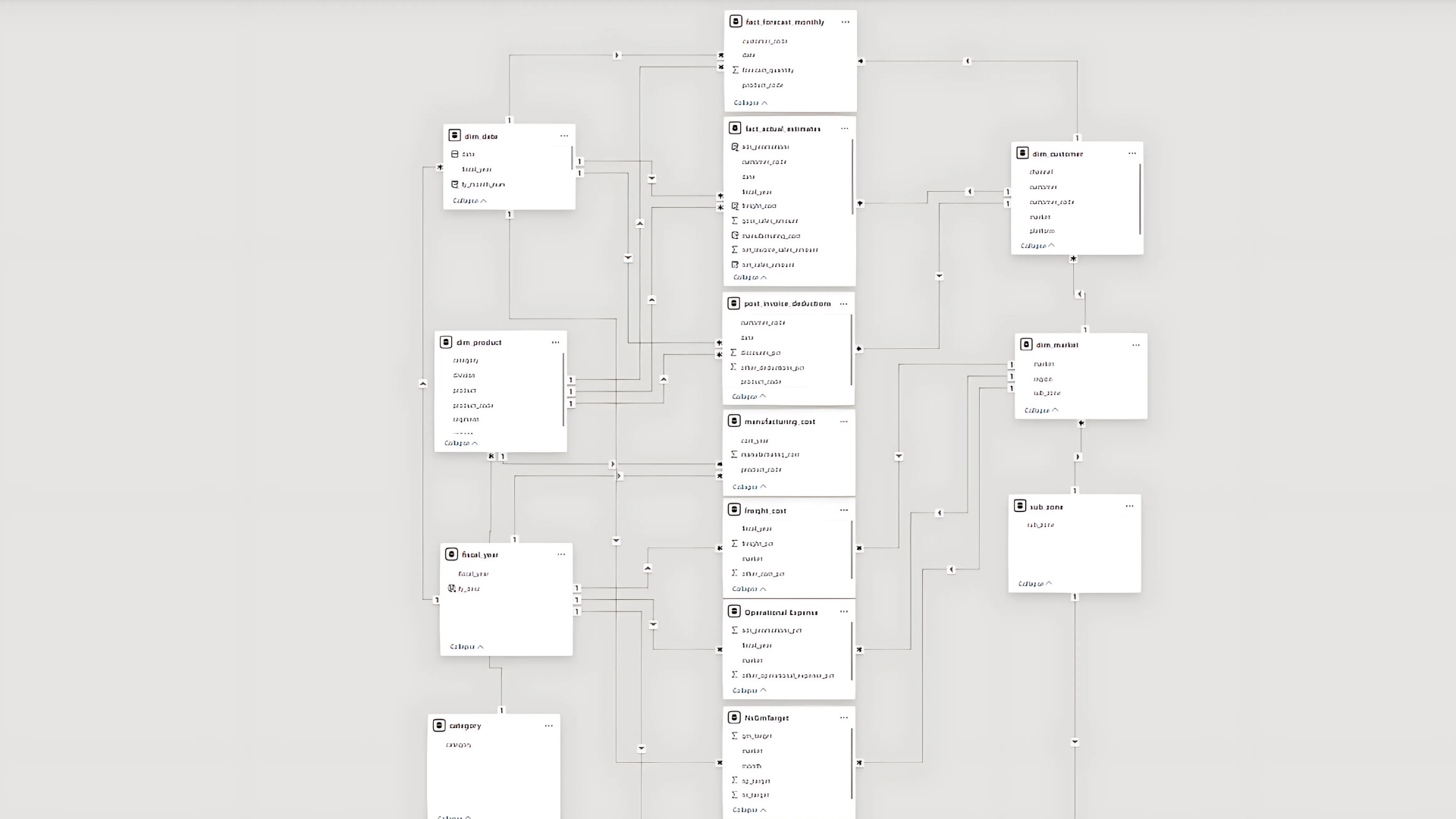
Schema 1 (Customer, Market & Product Data)
dim_customer → Customer details (name, code, region, platform, channel).
dim_market → Market breakdown (country, sub-zone, region).
dim_product → Product hierarchy (division, segment, category, product, variant).
fact_forecast_monthly → Monthly sales forecasts (date, product, customer, market, forecast quantities).
fact_sales_monthly → Monthly actual sales transactions (date, product, customer, market, sold quantities).
Schema 2 (Cost & Pricing Data)
freight_cost → Logistics costs as a percentage by market and year.
gross_price → Product-wise gross pricing by fiscal year.
manufacturing_cost → Manufacturing costs for each product per year.
post_invoice_deductions → Discounts & deductions after invoicing (customer-specific).
pre_invoice_deductions → Discounts applied before invoicing (annual % by customer).
Why This Structure Matters
Dimension tables provide descriptive context (who, what, where).
Fact tables capture measurable events (sales, forecasts, costs).
This separation allows building an optimized star schema in Power BI, ensuring efficient queries and accurate analysis across Sales, Finance, Marketing, and Supply Chain views.
Importing Data to Power BI
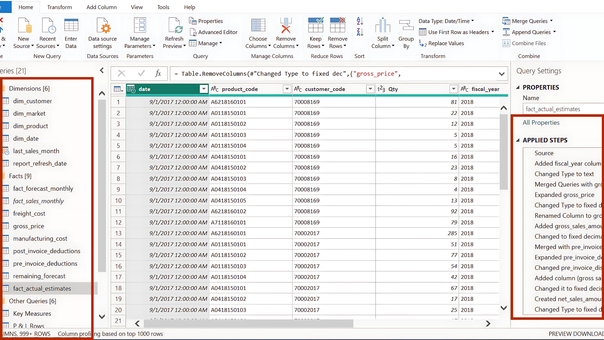
The SQL databases were connected directly to Power BI using the MySQL Database connector. After establishing the connection (via localhost), all relevant tables were imported for analysis. To maintain full control over the data model, I removed auto-detected relationships in Power BI and disabled the option for future loads.
Data cleaning and transformation were carried out in Power Query before loading the final model into Power BI. This involved standardizing table names, grouping them into dimension vs. fact tables, and applying column profiling to ensure data quality. Core cleaning tasks included removing duplicates, unifying date formats, handling inconsistent text values, and merging columns where needed.
One of the key steps was creating a Date Dimension table to support time intelligence analysis, as well as building a unified fact_actual_estimates table by appending actual sales with future forecasts. This ensured that the central fact table contained both year-to-date actuals and year-to-go estimates in a single structure.
To enrich the fact table, additional merges were performed with pricing tables (gross price, manufacturing cost) and deduction tables (pre- and post-invoice discounts). Custom columns were then introduced to calculate measures such as gross sales amount and net invoice sales amount, ensuring the dataset was fully business-ready.
Before loading into Power BI, unnecessary columns (e.g., customer name, product name, region — already present in dimension tables) were removed to reduce model size and improve performance.
Built Star Schema with a central Fact Table connected to multiple Dimension Tables (Product, Customer, Time, Region). Applied Snowflake Schema where normalization was required. Managed relationships (One-to-Many, Many-to-Many) carefully to avoid ambiguity—for example, fiscal year values were embedded in the Date Dimension to prevent many-to-many issues with Fact tables. Dimension tables serve as Master Tables and also work effectively for slicers (filters).
After building the data model, the next step is to move beyond Power Query transformations and define calculated tables, columns, and measures directly within Power BI using DAX (Data Analysis Expressions). This stage ensures that all financial and business logic is captured within the model, enabling accurate reporting, deeper analysis, and flexible visualization.
Key Steps
Organize key measures into Display Folders for easier navigation.
Use variables (VAR) inside measures for cleaner logic and easier debugging.
Keep calculations at the measure level whenever possible to optimize model performance.
Validate each step against business benchmarks before moving to visualization.
Data validation was performed by comparing current figures against benchmark values provided by the sales director, such as previous year’s sales. Most values aligned correctly, with only the forecast quantity showing a difference, which was resolved after confirming with the data engineer that a new product launch date had been missed.
Beyond benchmark comparison, other effective validation methods include cross-checking totals with source systems, reconciling aggregated numbers across different reports, applying data profiling techniques (such as checking for missing values or outliers), and using business rules (e.g., ensuring negative sales cannot exist). Together, these practices ensure accuracy, consistency, and trustworthiness of the dataset before analysis.
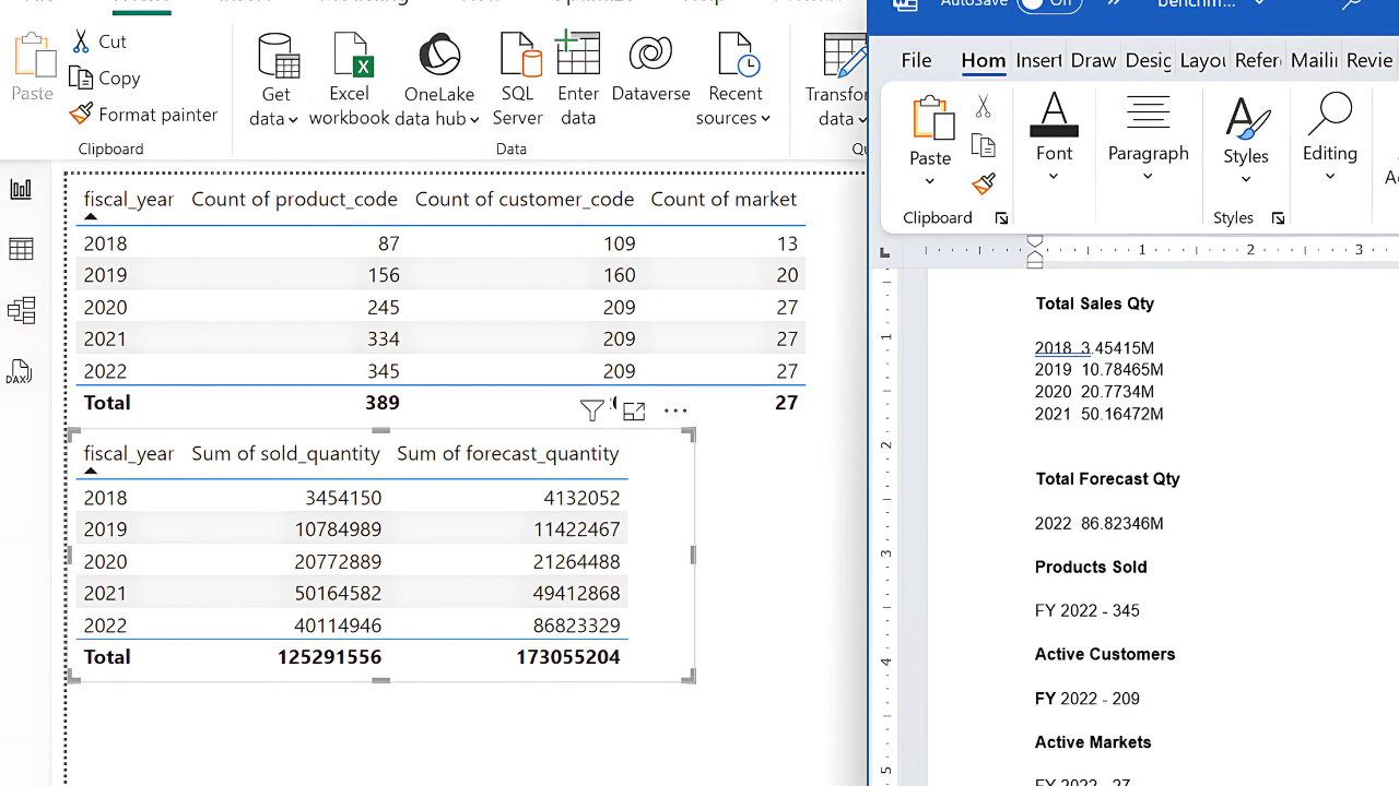
Built a matrix visualization in Power BI to validate calculations against business rules and historical benchmarks.
Cross-checked:
gross_sales_amount = Gross Price × Qty
pre_invoice_deduction_amount = Pre-Invoice % × Gross Sales
net_invoice_sales_amount = Gross Sales – Pre-Invoice Deduction
Verified totals with Finance/Sales benchmarks to confirm accuracy.
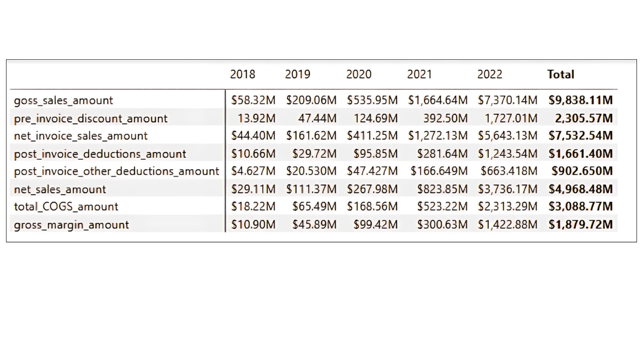
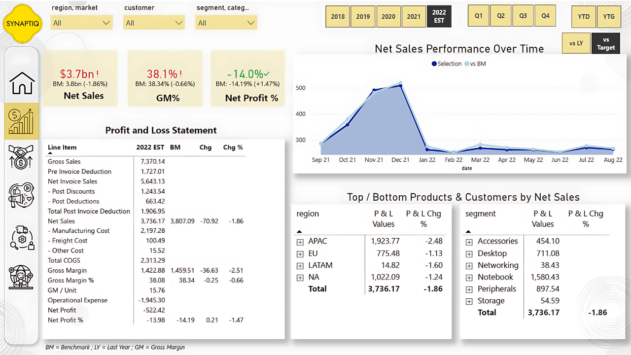
The Finance Dashboard was designed to provide a complete Profit & Loss (P&L) view, incorporating gross sales, deductions, costs, and profitability metrics. It was built in multiple stages, from creating base measures to adding dynamic calculations and formatting.
Building Core Financial Measures
Gross Sales (GS $): Captures the total value of sales before any discounts, serving as the baseline for all other calculations.
Net Invoice Sales (NIS $): Deducts pre-invoice discounts, giving the first “true” sales figure after direct reductions.
Pre-Invoice Deduction $: Highlights the impact of early discounts on gross sales.
Post-Invoice Deductions (two types): Breaks down additional customer/product-level deductions applied after invoicing.
Net Sales (NS $): A key performance metric that reflects sales after all discounts (both pre- and post-invoice).
Cost of Goods Sold (COGS): Summed from manufacturing, freight, and other costs to represent the direct cost of fulfilling sales.
Gross Margin (GM $ and GM %): Critical profitability measure, showing what remains after covering COGS.
Quantity & GM per Unit: Enables per-unit profitability analysis.
Structuring the P&L View
A P&L Rows table was created to define the order of financial statement items.
A measure called P&L Values was developed to dynamically pull the right metric (e.g., Gross Sales, Net Sales, COGS) into the report, ensuring a structured P&L statement inside Power BI.
Year-over-Year Comparisons
P&L LY: A measure was created to calculate last year’s equivalent values using SAMEPERIODLASTYEAR, enabling historical comparisons.
P&L YoY Change & %: Measures added to highlight both absolute and percentage changes year over year — useful for tracking growth or decline trends.
Enhancing Slicers and Fiscal Year View
A new column fy_desc was introduced to label the most recent fiscal year as “EST” (e.g., 2022 EST), making forecasts visually distinct.
This improved the usability of slicers and ensured stakeholders could clearly differentiate between actuals and forecasts.
Dynamic P&L Columns and Visuals
A P&L Columns table was created to add extra headers like LY, YoY, and YoY % alongside fiscal years.
The P&L Final Value measure allowed the report to display the correct values depending on user selection (e.g., 2021 actuals, LY, or YoY).
Dynamic titles were built (e.g., “Gross Margin Performance Over Time”) so charts update based on user-selected metrics, improving clarity.
Adding Time Intelligence
Quarter Columns were added to the date table for quarterly analysis.
Year-to-Date (YTD) vs. Year-to-Go (YTG): A column was introduced to split periods within a fiscal year, showing how much performance has been achieved versus what remains.
Operational Expenses & Net Profit
Additional expense categories (ads/promotions, other operational expenses) were integrated from an external file.
New measures were built for:
Operational Expense $ (sum of all OPEX categories)
Net Profit $ (Gross Margin – Operational Expense)
Net Profit % (Net Profit relative to Net Sales)
These rows were appended to the P&L table, expanding the view from Gross Margin down to Net Profit.
KPIs and Dashboard Layout
KPI cards for Net Sales, Gross Margin %, and Net Profit % (along with their LY comparisons) were placed at the top for quick financial health checks.
A dynamic line/area chart was built to show selected P&L metrics over time.
Tables and visuals were synchronized with slicers (fiscal year, YTD/YTG, quarters) to make exploration interactive.
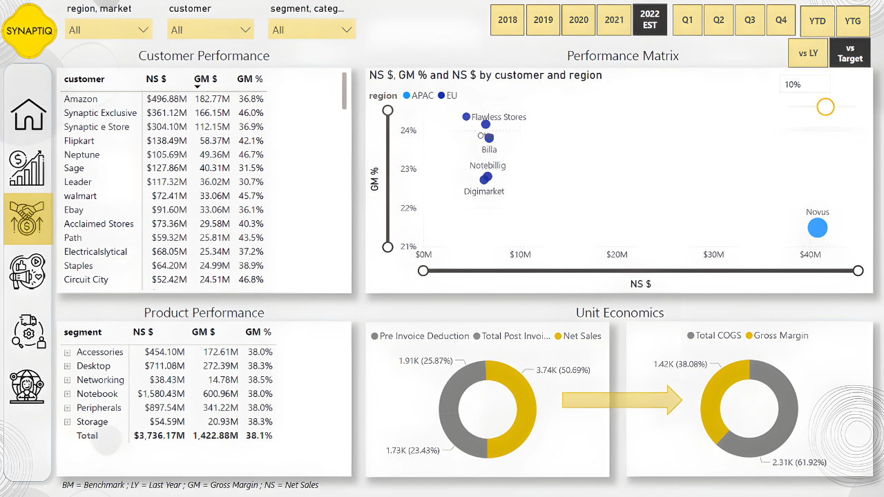
To design the Sales Dashboard, I began by creating a customer performance table highlighting net sales, gross margin, and gross margin %. These measures, already defined in earlier steps, were reused here to ensure consistency across visuals.
Next, I built a scatter plot with net sales on the X-axis and gross margin % on the Y-axis, using customers or markets as dynamic values, regions as legends, and bubble size mapped to net sales, with a zoom slider for detailed analysis.
To enhance interactivity, we synchronized slicers across reports, placing region & market filters in the top left, followed by customer, segment, and category filters, styled for clarity.
Finally, we added two donut charts—one showing pre/post-invoice deductions with net sales, and another comparing total COGS against gross margin—providing a compact yet comprehensive view of sales performance.
To build the Marketing Dashboard, I started by duplicating the Sales view tab and extending it with marketing-focused insights.
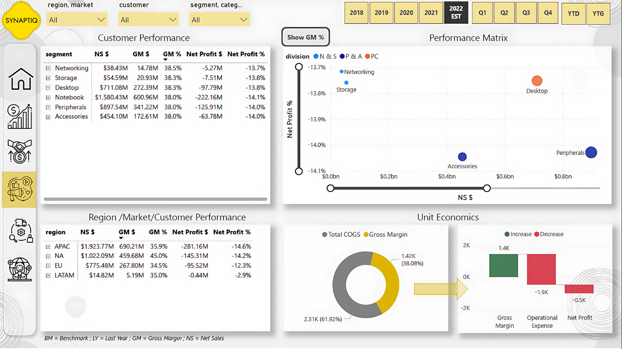
I created a product performance matrix that included additional measures such as net profit and net profit percentage, which allowed for a deeper profitability analysis at the product level.
For the scatter plot visualization, I shifted the focus from customer-level analysis to segment, category, and product as values, while using divisions as legends to highlight broader market patterns.
I also developed a regional performance matrix that included region, market, and customer, mirroring the product matrix to enable flexible analysis across different hierarchies.
For consistency with the Sales Dashboard, I retained the donut chart comparing total COGS and gross margin, ensuring stakeholders could interpret profitability in a familiar way.
Finally, I introduced a waterfall chart to break down gross margin, operational expenses, and net profit. To ensure operational expenses were displayed correctly as negative values, I adjusted the formulas so that expenses would reduce gross margin, resulting in an accurate net profit calculation. This approach made it easier to track marketing costs against profitability while maintaining consistency with financial reporting.
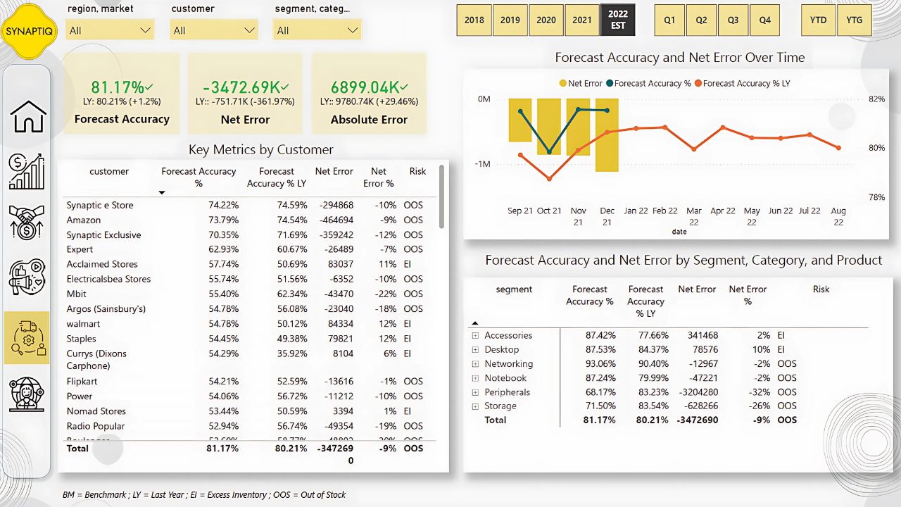
To build the Supply Chain Dashboard, I first defined the key KPIs to track: Net Error, Absolute Error, and Forecast Accuracy. These metrics are essential for understanding how well forecasts align with actual sales and for identifying risks such as excess inventory or stockouts.
Since the fact table only contained total quantity, I needed to separate sales quantity and forecast quantity. To achieve this, I leveraged the Last Sales Month table, enabling load in Power Query if it was previously disabled, and updated dependent formulas in the date table to reference this new table instead of the larger fact dataset. This optimization reduced model size and kept calculations consistent.
With sales and forecast quantities separated, I created measures to calculate Net Error (forecast quantity minus sales quantity) and Net Error percentage, which highlighted the deviation between expected and actual demand. To avoid misleading results from aggregations where positive and negative errors could cancel each other out, I applied row-level calculations using SUMX across months and products to compute Absolute Error and Absolute Error percentage. This gave a more accurate view of forecasting accuracy across different granularities.
From these measures, I calculated Forecast Accuracy as one minus the absolute error percentage and refined it to return blanks where appropriate, ensuring cleaner visuals. I also built year-over-year comparisons for Forecast Accuracy, Net Error, and Absolute Error using time intelligence functions like SAMEPERIODLASTYEAR, which helped in tracking improvements or declines over time.
For visualization, I designed a line and clustered column chart with Net Error as columns and Forecast Accuracy (current and prior year) as lines to provide a clear picture of forecast reliability. To enhance interpretability, I introduced a Risk indicator measure that classified scenarios as “Excess Inventory” when forecasts overshot actual sales and “Out of Stock” when forecasts undershot demand.
Finally, I created KPI cards for Forecast Accuracy, Net Error, and Absolute Error. These cards were configured to display improvements in green, ensuring stakeholders could immediately see progress. For instance, when Net Error decreased by 22% compared to the previous year, I adjusted the KPI settings so that reductions in error were shown as positive performance. This dashboard not only quantified supply chain efficiency but also made risks and improvements highly visible to decision-makers.
To enrich the analysis beyond year-over-year comparisons, I incorporated target benchmarks into the model. I started by bringing in the provided Excel file containing net sales, gross margin, and net profit targets at the country level. From this file, I created measures for absolute target values as well as percentage targets, which formed the foundation for aligning actual performance against expectations.
Since the targets were only available at the aggregate level (country and not customer or product), I applied business logic to interpret them properly. For example, absolute values such as total net sales targets were kept at the aggregate level, whereas percentage-based targets like gross margin % were assumed to apply uniformly across customers or products when detailed benchmarks were not available.
To give flexibility, I created a toggle button that allowed switching between “vs Last Year” and “vs Target” views. This required additional measures that dynamically switched calculations depending on the user’s selection. It enabled executives to instantly compare whether a metric was improving against historical performance or progressing towards business goals.
A challenge I faced was handling filters when users drilled down to customers or products, since no such detailed targets existed. To resolve this, I introduced logic that blanked out target values in such cases, preventing misleading comparisons. At the same time, I ensured percentage measures like gross margin % remained functional by basing them on aggregate targets instead of customer-level allocations.
I also enhanced the P&L table so that it could display not just actuals and YoY changes, but also benchmark values and their variances. This required refining the calculations to ensure that rows without target definitions, such as manufacturing cost or deductions, returned blanks instead of artificial differences. In this way, the P&L table remained clean and meaningful.
To improve usability, I added a message measure that displayed alerts whenever targets were unavailable for the selected period or filters. This helped prevent confusion and guided users on data availability.
For visualization, I expanded KPI cards and charts to accommodate both types of benchmarks. For example, gross margin % and net profit % KPI visuals now dynamically showed whether the comparison was vs last year or vs targets, depending on the toggle. Additionally, I created a line chart with “vs Benchmark” overlays, making trends clearer.
To support more interactive analysis, I built a “what-if” parameter slicer for target gap tolerance. This allowed users to set a threshold (e.g., 10% shortfall against gross margin % target) and instantly filter customers falling behind. This made it easy to identify risk areas.
Finally, I introduced usability features such as toggle buttons in the Marketing Dashboard to switch between gross margin % and net profit %, and tooltips in the Sales Dashboard to show customer-level sales and margin trends over time. These small enhancements made the benchmarks far more actionable in day-to-day decision-making.
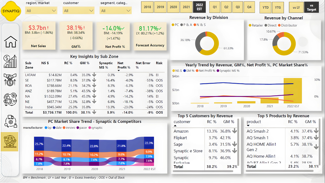
To build the Executive Dashboard, I started by duplicating the Finance View and adapting it for higher-level executive insights. I added KPI visuals aligned with the mockup and created a Key Insights by Sub Zone table. For this, I introduced a risk measure that categorized performance gaps: if the net error was greater than zero, it indicated excess inventory, while if it was less than zero, it highlighted out-of-stock issues. This measure helped me quickly flag operational risks.
Next, I added a revenue contribution percentage to evaluate how much each zone contributed to overall net sales. Initially, I calculated this by dividing net sales by the total net sales across all subzones, but it only worked correctly at the zone level and failed to aggregate properly when applied to customers, products, or markets. To fix this, I recalculated revenue contribution by dividing net sales by the total net sales across all customers, markets, and products, ensuring accuracy across multiple dimensions.
I then introduced a gross margin variance measure, which I used for conditional formatting. Whenever the variance between actual and target gross margin was unfavorable, a downward arrow icon appeared in the visuals. This was important for immediately signaling margin performance issues to executives. To maintain the clarity of insights, I excluded some visuals, such as the line clustered chart and ribbon chart, from fiscal year filters by adjusting the interaction settings, making sure these visuals remained consistent regardless of filter changes.
Since I had previously built a Market Share tab, I leveraged it by creating a focused measure for AtliQ. This measure calculated AtliQ’s market share independently, ensuring that when India or any other region was selected from the Key Insights table, the ribbon chart displayed AtliQ’s performance correctly without being overridden by other manufacturers’ data.
Finally, I enriched the Executive Dashboard by adding Top 5 customers and products based on revenue and gross margin percentage. To highlight underperformers, I applied a filter on gross margin variance, showing only those with unfavorable variances. For ranking, I used a Top N filter set to five, based on net sales values, ensuring executives could quickly see which customers and products were most significant to revenue and profitability.
I created DAX measures to calculate customized KPIs and added tooltips and KPI cards to make key metrics easily visible and understandable.
I implemented what-if parameters so users could test different scenarios and integrated targets from Excel to benchmark performance against business goals.
I set up scheduled refreshes from SQL and SharePoint so the dashboards remain automatically updated, ensuring accurate and timely decision-making without manual intervention.
For derailed insights about key learnings and business impact Click Here

I help businesses transform raw data into meaningful insights